Every developer portfolio starts to blend in if you let it. My tailwind v4 framer motion ui stack was built to do the opposite: feel cinematic, stay fast, and avoid the usual dependency pile.
I wanted a personal site that looked handcrafted, moved smoothly, and loaded quickly on real devices. In this article, I break down the exact tailwind v4 framer motion ui stack I use, why I chose it, and what I would change after testing it in production.
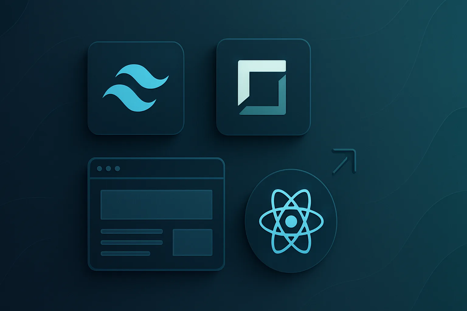
The Core Stack
I kept the stack small on purpose. Each tool has a clear job, and I only keep what pulls its weight.
I tested this setup in a live personal site, not a toy project. The result was clear: fewer dependencies, cleaner UI code, and less time spent fighting defaults. That matters when you want a site that feels premium without becoming fragile.
Why I skipped heavier UI libraries
I did not want a library to dictate my design. I wanted full control over spacing, glow, glass effects, and motion timing. In my experience, the more opinionated the component stack, the more time you spend undoing it.
That is why this tailwind v4 framer motion ui stack works for me. It gives me the speed of utility-first CSS and the expressive power of motion without dragging in a big design system.
If you build systems like I do, you will recognize the same principle in AI ersätter inte dig — men användaren som bygger bättre system med AI vinner→ and Obsidian AI Documentation for E-Commerce Systems→.
Tailwind v4: No Config File, Just CSS
Tailwind v4 changed the way I think about design tokens. Instead of keeping theme settings in a JavaScript config file, I define them directly in CSS with `@theme`.
My entire color system lives in `globals.css`.
@theme {
  --color-background: #050505;
  --color-foreground: #fafafa;
  --color-accent: #f97316;
  --color-cyan: #22d3ee;
  --color-purple: #a78bfa;
  --color-card: #0c0c0e;
  --color-border: #1c1c1f;
}
That means classes like `bg-card`, `text-accent`, and `border-border` all map to real CSS variables. I like this because the tokens stay close to the styles they control. It is easier to maintain, easier to debug, and easier to override when needed.
The same pattern handles typography.
@theme {
  --font-sans: var(--font-geist-sans);
  --font-mono: var(--font-geist-mono);
  --font-display: var(--font-unbounded);
}
I use Geist Sans for body text, Geist Mono for code, and Unbounded for display headings. I load them with `next/font` and `display: "swap"` so I avoid layout shift.
Why I chose Tailwind v4 over v3
Tailwind v4 removes friction in the places that slow developers down. I do not need a separate config file, and I do not need to move between CSS and JavaScript to adjust tokens.
That also makes the tailwind v4 framer motion ui stack easier to scale. When the style system is simple, motion and layout become easier to reason about.
If you want more context on how I think about design systems and automation, read AI ersätter inte dig — men användaren som bygger bättre system med AI vinner→ and Obsidian AI Documentation for E-Commerce Systems→.
Tailwind v4 Framer Motion UI Stack: Why Motion Matters
A static portfolio feels safe, but it rarely feels memorable. Framer Motion gives me the control to make the site feel alive without making it heavy.
I use Framer Motion 12 for scroll reactions, reveal transitions, and animated lists. The important part is that I do not animate everything. I animate only the moments that improve clarity or mood.
This tailwind v4 framer motion ui stack works because the motion supports the content. I want the reader to notice structure first, then movement.
Scroll-linked transforms
The hero section has a depth-zoom effect where letters move outward as you scroll. I build it with `useScroll()` and `useTransform()`, which lets me map scroll progress to position and scale.
const { scrollYProgress } = useScroll();
const x = useTransform(scrollYProgress, [0, 1], [0, targetX]);
const scale = useTransform(scrollYProgress, [0, 0.5], [1, randomScale]);
I seeded the offsets so the motion feels organic, not random in a sloppy way. That kind of detail matters when you want a visual system that feels intentional.
Viewport-triggered reveals
For most sections, I use a simple fade-and-slide pattern when content enters the viewport.
<motion.div
  initial={{ opacity: 0, y: 60 }}
  whileInView={{ opacity: 1, y: 0 }}
  transition={{ duration: 0.8 }}
  viewport={{ once: true }}
/>
The `once: true` setting is not optional for me. I tested repeated triggers, and they waste frame budget on content the user already saw. For a smoother experience, I prefer motion that gets out of the way.
Staggered lists and dynamic content
For grids and card layouts, I use staggered children so the interface enters in sequence. It feels cleaner and easier to scan.
I also use `AnimatePresence` when filtering blog posts. That keeps cards from popping in and out abruptly. This is one of the core reasons the tailwind v4 framer motion ui stack feels polished instead of generic.
For motion-focused reading, I also recommend The future of music plugins: 7 trends for producers in 2026→ and Best VST plugins for 2026: top picks by category→.
Smooth Scroll Without the Bloat
Lenis gives the site a softer scroll feel. I like it because it brings just enough inertia to make the page feel premium, but not so much that the interface becomes sluggish.
I use a custom easing curve and a short duration.
new Lenis({
  duration: 1.2,
  easing: (t) => Math.min(1, 1.001 - Math.pow(2, -10 * t)),
  smoothWheel: true,
});
The important part is cleanup. I learned quickly that Lenis instances need to be destroyed and recreated on route changes. If you skip that step, scroll listeners can stack up and create memory leaks.
That is why I wrapped the logic in a dedicated `SmoothScroll.tsx` component with proper React effect cleanup. It is a small implementation detail, but it protects performance over time.
If you care about performance-minded motion, read AI ersätter inte dig — men användaren som bygger bättre system med AI vinner→ and The future of music plugins: 7 trends for producers in 2026→.
Custom Components Instead of a UI Library
I built my own primitives instead of adopting shadcn, Radix, or Headless UI. That choice saved me from adapting my design to someone else’s defaults.
My core primitives include:
Why I do not use shadcn here
I respect shadcn, but it is not the right fit for every project. I do not need the extra abstraction for a portfolio where the components are simple and the design language is custom.
In my experience, a component library helps when you want speed and consistency across a large product team. For a personal site, I wanted full visual control and a smaller dependency surface. That is especially true when the design depends on glassmorphism, glow, and motion timing.
The only shared helper I use is `cn()` from `clsx` and `tailwind-merge`. That keeps class composition clean without adding much weight.
If you want another example of how I structure systems with minimal overhead, see AI documentation with Obsidian for e-commerce systems and AI ersätter inte dig — men användaren som bygger bättre system med AI vinner.
Glassmorphism as the Visual Language
The site leans on glassmorphism for its identity. I use semi-transparent surfaces, blur, and subtle borders to create depth without visual noise.
.glass-card {
  background: rgba(12, 12, 14, 0.3);
  backdrop-filter: blur(12px);
  border: 1px solid rgba(28, 28, 31, 0.5);
  border-radius: 1rem;
}
The navbar uses a stronger blur so it stays readable over motion-heavy sections. Cards use a lighter blur, which keeps content legible while preserving the layered look.
Gradient text and accents
I also use gradient text to add depth to headings and CTAs.
.gradient-text {
  background: linear-gradient(135deg, #fff 0%, #71717a 100%);
  -webkit-background-clip: text;
  -webkit-text-fill-color: transparent;
}
The result is subtle but effective. It makes the site feel designed rather than assembled. That matters if you want to stand out from the usual template-style portfolio.
For related design thinking, you can also read Best limiter plugin: proven picks to boost loudness→ and Best VST plugins for 2026: top picks by category→.
Pure 2D Canvas for the Background
My background animation, Neural Canvas, looks more complex than it is. I render it with the 2D canvas API, not Three.js.
The scene uses animated nodes and signal packets that travel between them. I also scale for device pixel ratio so the animation stays crisp on retina displays.
I like this choice because it is predictable. WebGL can be powerful, but it also adds more failure modes than I need for a background layer. The 2D canvas API gives me enough control for network-graph visuals and runs well on mobile.
That is another place where this tailwind v4 framer motion ui stack earns its keep. The stack stays light, but the experience still feels rich.
If you are building motion-rich interfaces, keep your rendering strategy simple. A lot of visual quality comes from timing, spacing, and contrast, not from extra libraries.
Typography and Responsive Rhythm
I use `clamp()` for fluid typography instead of fixed breakpoints. That keeps the site feeling smooth as the viewport changes.
font-size: clamp(2.5rem, 9vw, 7rem);
font-size: clamp(2rem, 5vw, 3.5rem);
This removes the hard jumps I used to see in older responsive systems. Titles scale naturally, and the interface feels more deliberate.
My layout is mobile-first, with standard breakpoints and a centered content container. I keep the gutters responsive so the site never feels boxed in on desktop or cramped on phones.
Responsive patterns I rely on
This is where the stack becomes practical. Tailwind handles spacing fast, and Framer Motion keeps motion consistent across breakpoints.
Performance Choices That Actually Matter
I care about performance because a slow portfolio hurts credibility. It also hurts engagement, which means fewer people reach the work you want them to see.
I use dynamic imports for heavy below-the-fold sections.
const About = dynamic(() => import("@/components/About"));
const Ventures = dynamic(() => import("@/components/Ventures"));
const Music = dynamic(() => import("@/components/Music"));
const Tech = dynamic(() => import("@/components/Tech"));
const Blog = dynamic(() => import("@/components/Blog"));
I also keep `next/image` optimized with responsive srcsets, priority only where it matters, and CSS-only glows whenever possible. I tested reduced motion support as well, because accessibility matters and it helps users with motion sensitivity.
According to the Tailwind CSS documentation, theme tokens work best when they stay close to the styling layer. And Framer Motion documents scroll-driven animation patterns that match the way I build this site.
Small performance wins I keep
These are not flashy tricks. They are the kind of choices that keep the experience fast enough to matter.
If you are comparing stack choices, also read Best limiter plugin: proven picks to boost loudness→ and 2026’s best VST plugins: proven picks by category→.
What I Would Change Next
I do not treat this stack as finished. I treat it as a working system that I can improve.
First, I would remove any dead dependencies that are not imported. If GSAP or Three.js sits in `package.json` without real usage, it only adds confusion. I prefer a dependency list that reflects reality.
Second, I would add a softer reader mode for long-form blog posts. The homepage should stay dark and dramatic, but long articles benefit from a calmer reading surface.
Third, I would move more of the mode system into pure CSS. The current context-based approach works, but CSS variables and attribute selectors could simplify it even further.
That is the mindset behind the tailwind v4 framer motion ui stack: keep what works, remove what does not, and improve the user experience with each iteration.
For more practical systems thinking, I also recommend The future of music plugins: 7 trends for producers in 2026→, Best VST plugins for 2026: top picks by category→, and AI ersätter inte dig — men användaren som bygger bättre system med AI vinner.
Image Ideas
Adding images like these helps engagement and makes the article easier to scan. It also gives search engines more context around the tailwind v4 framer motion ui stack.
FAQ
Is Tailwind v4 better than Tailwind v3 for a personal site?
For my kind of build, yes. Tailwind v4 removes friction by moving tokens into CSS and simplifying theme management. That makes it easier to maintain a personal site with custom visuals, motion, and fast iteration. If you value control and speed, the upgrade is worth it.
Why use Framer Motion instead of CSS animations only?
CSS animations cover simple transitions, but Framer Motion gives me better control over scroll-linked motion, list staggering, and viewport triggers. I use it when motion needs to react to user behavior. That makes the interface feel more intentional and easier to tune.
Does Lenis hurt performance?
Not when I use it carefully. I keep the easing tight, avoid unnecessary scroll effects, and clean up instances on route changes. The bigger risk is poor implementation, not the library itself. Used well, Lenis improves perceived polish without making the site feel heavy.
Why build custom UI components instead of using a library?
I build custom components when the design language is specific and the app does not need a huge shared component system. That gives me more control over spacing, glow, glass effects, and motion timing. It also keeps the dependency graph smaller and easier to maintain.
What matters most in a motion-heavy portfolio?
Clarity and restraint. Motion should guide attention, not distract from the content. I focus on smooth transitions, responsive typography, and strong contrast before I add visual effects. That is what keeps the site memorable without hurting usability.
Takeaway
This stack works because it stays focused:
If you are building your own site, start small and test every choice in a real session. The best stack is not the one with the most tools. It is the one that helps you ship a site people remember.
The tailwind v4 framer motion ui stack is my answer to that problem, and I would build it this way again. If you want more practical build breakdowns, read Best VST plugins for 2026: top picks by category and The future of music plugins: 7 trends for producers in 2026→.